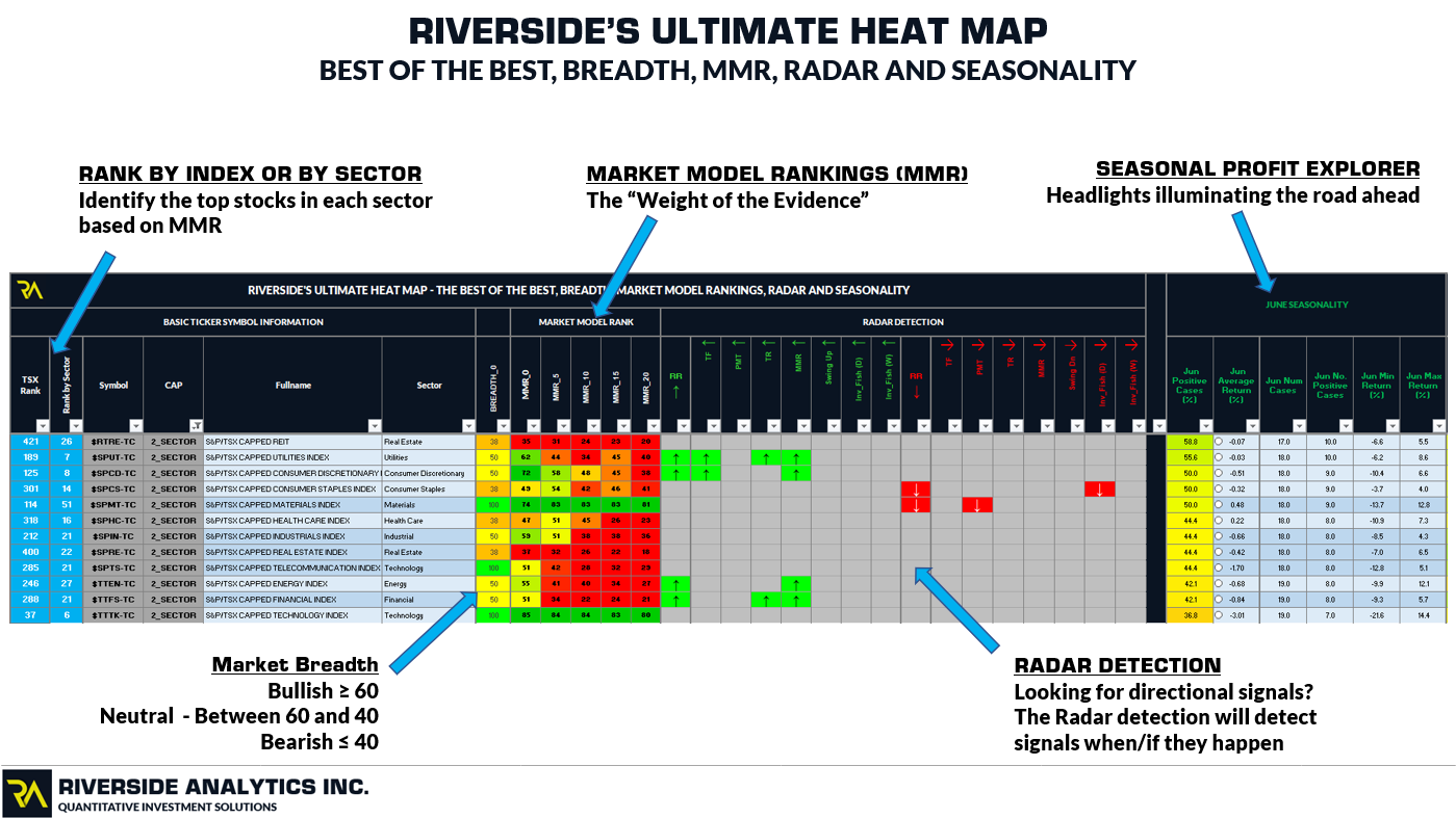
RIVERSIDE’S ULTIMATE HEAT MAP
Our suite of tools at Riverside have been developed to compliment each other. With these various tools we have, we wanted a way to use all of these tools systematically in conjunction with one another. Generally, when we were looking to combine our tools to;
- Combine our tools into one simple and concise location;
- Reduce our and our client’s time spent analyzing the market;
- Focus our and our client’s efforts on what matter’s most;
After much trial and deliberation we decided to produce an Ultimate Heat Map. Our Ultimate Heat Map maintains similar characteristics to our other product offerings, however, we combined features of our Market Breadth Indicators and Seasonality Profit Explorer with key features of our Regular Heat Map to meet our goals as noted above.
Advanced Filtering and Ranking
Our Standard Heat Map has the ability to isolate various baskets of ETF’s based on ETF Category, ETF Sub Category, Overall Rank, Category Rank and Sub-Category Rank if desired. While this is a powerful feature of our standard Heat Map, we wanted to improve this feature of the Heat Map to reduce time. Accordingly, within our Ultimate Heat Map, we created a “Funnel” for both ETF’s and stocks. In this section we will detail the our Advanced Filtering and Ranking for US ETF’s. This same process can be used for Canadian ETF’s as well.
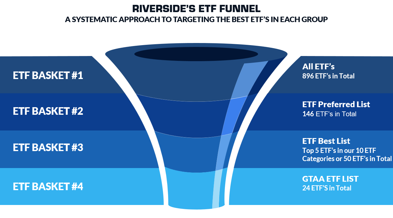
As of the close on July, 2024, we have 2,700+ US ETF’s in our US ETF database (ETF Basket #1). This large basket of ETF’s target a wide range of Index’s, Sectors, Fixed Income Assets, Commodities, etc. While this large list is very comprehensive, we have built a feature into our Ultimate Heat Map to reduce this large ETF list down to a Preferred ETF List (ETF Basket #2). This Preferred ETF List has been hand picked by Riverside staff to target the main ETF’s in each ETF category. Our Preferred ETF List very quickly reduces the large list of US ETF’s down to 218 ETF’s within three clicks of a mouse. Finally, for investors looking to keep it as simple as possible, we have created a feature in our Ultimate Heap Map to reduce the large ETF Basket #1 down to a highly targeted and diverse ETF list of 24 ETF’s, known as our Global Tactical Asset Allocation (GTAA) ETF List.
Regardless of the area of investor interest, the ETF Funnel that we have created in our Ultimate Heat Map is lightning fast and enables Investor’s to reduce time and concentrate on ETF’s that they are interested in. Our new Ranking features inside the Ultimate Heat Map can further be used to identify the Top 1,2,3,5, etc ETF’s in each ETF Basket.
Market Breadth
Market Breadth is a key pillar of our Portfolio Shield and accordingly we were looking for a simplistic way to include Market Breadth into our Ultimate Heat Map. In maintaining our goal of keeping the Ultimate Heat Map as simple as possible, we have included our Binary Market Breadth Metrics for equity ETF’s. To do this we have paired ETF’s with a “Surrogate” Breadth Index. For example if we have a Breadth ticker symbol for a particular Index (i.e the S&P 500) we have paired our Breadth Index with that ticker symbol. Where a direct match between a specific ticker symbol and our Breadth Index’s is not available, we have hand selected a “Surrogate” Breadth Index that is a close match. For example, we do not have a Breadth Index for the S&P 500 High Beta ETF (SPHB) but we do have a breadth index for the S&P 500 directly. Accordingly, the “Surrogate” Breadth Index for the SPHB ETF is the S&P 500. This methodology has been produced primarily for ETF’s given variability of composition in various ETF’s. Stocks inside the S&P 1500 and TSX have been paired directly with their respective Sector Market Breadth Indicators.
Inside the Ultimate Heat Map, our Binary Breadth Metrics provide a Bullish, Neutral or Bearish Breadth Reading. This is truly maintaining our goal of providing a simplistic yet effective way of analyzing market breadth.
For additional information on our Market Breadth Indicators CLICK HERE
Riverside Performance Ranking (RPR)
Our Ultimate Heat Map features our Weight of the Evidence indicator, the Riverside Performance Rank (RPR) for each ticker symbol. Within our Ultimate Heat Map we have provided a concise look back period of 1-month on this indicator to show the fluctuation of the Weight of the Evidence over the past month. This indicator is at up most importance as it detects the current strength or weakness of any ticker symbol.
For additional information on our Market Model Ranking CLICK HERE (Note MMR was replaced by RPR – website needs to updated.)
Seasonality Profit Explorer (SPE)
Our Seasonality Profit Explorer (SPE) has been a recent addition to our indicator suite. Our algorithm analyses monthly price data and allows us to see the seasonal price fluctuations for all ticker symbols within our database. This algorithm allows us to see the seasonal price fluctuations for all ticker symbols within our database. This particularity helpful as our Market Model Rankings and Breadth Metrics provide insight into the current health, strength and weakness of the markets while our SPE indicator suite helps us asses current and future seasonal probabilities. Currently the Ultimate Heat Map houses the following SPE metrics;
- Calculated Monthly returns;
- Number of Cases (i.e months);
- Number of Positive Cases;
- Percentage of Positive Cases;
- Average Return (%);
- Minimum Return (%);
- Maximum Return;
For additional information on our Seasonality Profit Explorer (SPE) CLICK HERE
Ultimate Heat Map Overview
The above commentary has summarized how we have constructed our Ultimate Heat Map. We have provided a final overview of the Ultimate Heat Map below showing the various features as noted above. This is truly a very powerful tool and a must have for active investors and traders.
(wy 2024_0728 – update this section as the Heat Map as evolved since this image was created.)