RIVERSIDE’S HEAT MAP
The Heat Map is a proprietary color-coded visual tool that has been specifically designed to detect strength and weakness in the market regardless of where the strength and weakness may lie. The Heat Map is comprised of timeless basic concepts including Trend Following, Relative Strength and Technical Analysis.
The Heat Map is 100% dependent on market data which means that the Heat Map will fluctuate with varying market conditions without bias. We have designed this invaluable tool from the ground up and it is our right hand in helping us successfully navigate the markets each and every week. In this page we have outlined what the Heat Map is and how we and our members use this unique tool. Our Heat Map is truly a one of a kind and we hope to show you how this tool will be a considerable ally. The topics we cover in this portion of the website include the following;
- General Overview;
- Top Performing Stocks and ETF’s;
- Isolation of Stocks and ETF Groups;
- Value vs Momentum;
- Market Sentiment;
- Heat Map Radar;
- Excel Based;
General Overview
The Heat Map is available in excel/spreadsheet format for anyone with a spreadsheet based software to be able to use. Below is a brief outline of various parameter’s used inside the Riverside Heat Map;
- RV = Relative Value;
- VLT = Volatility (Short Term);
- HVLT = Volatility (Long term);
- LQD = Liquidity (Volume);
- TR = Technical Rank or Indicator Sentiment;
- TF = Trend Filter;
- PMT = Price Momentum Tracking;
- LT-RS = Long Term Relative Strength;
- MTG = Market Temperature Gage and;
- MMR = Market Model Rank
A snapshot of our Global Market Heat map, updated as of the close on May 5, 2020 is illustrated below;

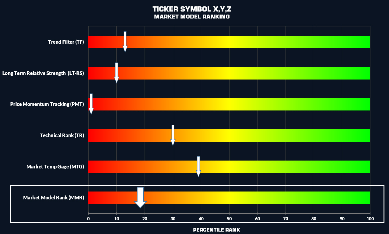
Our key Heat Map metric of reference is the Market Model Ranking (MMR) .The Market Model Ranking is the “Weight of the Evidence” indicator in the Heat Map. This metric summarizes the various metrics of the Heat Map, based on a top down approach into one concise indicator. The Market Model ranking has been converted into a percentile ranking from 0 (bearish-red) to 100 (bullish-bright green). A reading of 50 would be considered Neutral. Our Market Model Ranking specifically consists of the following;
- Trend Filter (TF) – absolute measure based on ticker symbol metrics only;
- Long term Relative Strength (LT-RS) – a relative measure , ticker vs a basket of ticker symbols;
- Price Momentum Tracking (PMT) -a relative measure, ticker vs a basket of ticker symbols;
- Technical Rank (TR) – an absolute measure based on ticker symbol metrics only;
- Market Temperature Gage (MTG) – Market Specific;
Graphically, the MMR would be compiled as shown below;
Excel Based
As you may have noticed above, the Heat Map is Excel based or spreadsheet based. Other than a membership to Riverside, a charting platform is not needed to use the Heat Map. We have intentionally created the Heat Map in excel to make the Heat Map accessible to anyone with a home based computer.
Top Performing Stocks and ETF’s;
As of May 2020, the Heat Map as been configured to track the S&P 1500, Toronto Stock Exchange (TSX), US ETF’s and Canadian ETF’s. This means that within our database, we are able to analyse over 3000 ticker symbols with the Heat Map. Within the Heat Map itself, we have been able to successfully rank stocks and ETF’s based on their respective Market Model Rankings.
Stocks have been ranked based on their Overall performance, Sector performance and Industry Group performance. This ranking system within the Heat Map enables us to quickly identify both Momentum and Value based opportunities within various market sectors.
In general, the world of ETF’s is vast. As of May 2020, there is almost 2000 ETF’s to choose from when looking at a basket of both Canadian and US ETF’s. These ETF’s have been created by a number of financial institutions to target specific assets or varying combinations of assets across the globe. In total, any one of these ETF’s could fall within one of more than 80 categories. These categories could include major indices, sectors, fixed income assets, commodities, etc. At Riverside, we have taken the liberty to simply the ETF world into a total of 10 distinct categories including;
- Broad Index;
- Alternative;
- International;
- Sector;
- Industry Group;
- Fixed Income;
- Dividend;
- Commodities;
- Currencies;
- Inverse/Leveraged;
Based on the above simple classification of ETF’s we are able to quickly identify the top performing ETF’s within each ETF Category. Each week, members are provided with our ETF best list to quickly identify the best investment candidates. The screen shot below illustrates our ETF best list as of the close on Thursday May 7, 2020;

Isolation of Stocks and ETF Groups
The Heat Map has the unique ability to be sorted based on the various technical criteria, or based on Index, Sector, Industry Group, ETF group, etc. Within a few clicks of a mouse, the Heat Map can be used to target your favorite stocks or ETF’s. Once the Heat Map has been filtered based on your criteria, it is easy to compare ticker symbols and select the most appropriate investment or trading vehicle for you. Alternatively, if you are looking for momentum or value opportunities, the Heat Map has the ability to search for both as outlined below;
Value vs Momentum
At Riverside, we prefer to go with strength and stay away from weakness. However, we recognize that there is not a single way to invest. There are many ways to successfully invest. Whether you are a momentum based investor or a value based investor or even possible a combination of both, each investment method has it’s own advantages and disadvantages. We discuss both approaches below;

Each week, Momentum Assets (Overvalued Assets) or Value Assets (Undervalued Assets) can be quickly determined using our Heat Map. The images below illustrate the TSX Sectors based on our Heat Map Market Model Rankings (MMR). Assets with MMR values greater than the TSX Index itself are considered Momentum based assets while assets with MMR Ranking less than the TSX Index itself are considered Value based assets. As the close on May 7, 2020, Technology, Materials and Consumer Staples are showing momentum. Assets presenting value include Real Estate, Financials and Energy.

Regardless of the approach, the Heat Map will quickly detect assets that are right for you.
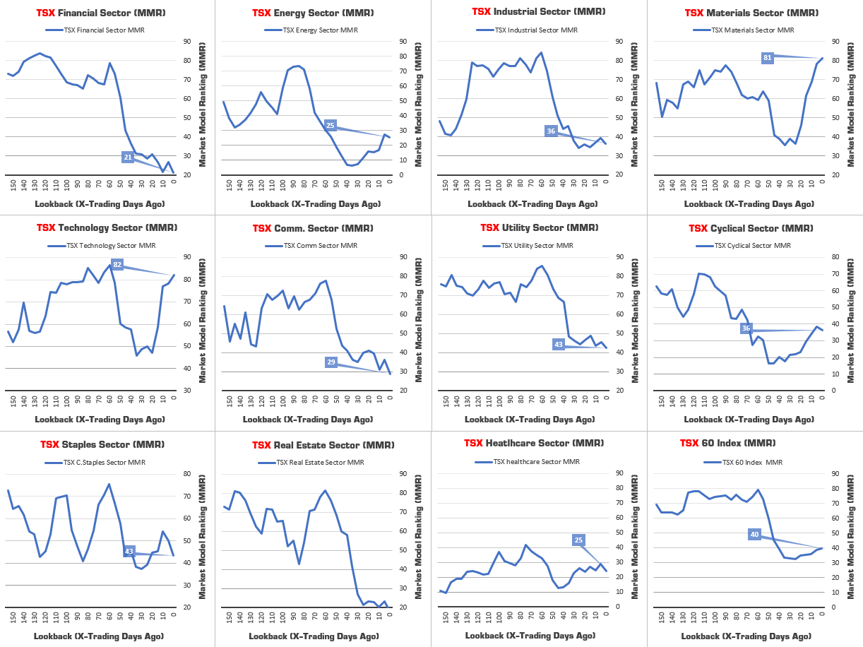
Market Model Rankings (MMR) – Sector Snapshots
While the Heat Map is excel based, we like visuals. To visualize our MMR values we have created snapshots. These snapshots are provided for Major Global Assets, US Sectors and TSX Sectors to members each week. This visual enables us to quickly asses changing market conditions, leaders and laggards. The image below illustrates the TSX Sector MMR Snapshots as of the close on May 6, 2020. A brief visual inspection below shows that the TSX Financials and Real Estate Sectors are lagging sectors and continuing to show degradation of strength with their declining MMR lines. Conversely, the Materials and Technology Sector continue to show increasing strength with rising MMR lines.
Using the Heat Map to Assess Market Sentiment
We have been able to classify all ticker symbols in the Heat Map as an Offensive asset or a Defensive asset based on the asset’s Beta. Beta is a measure of volatility or systematic risk of a security or portfolio in comparison to the market or benchmark as a whole. The Heat Map Calculates a 3-yr Beta for all US ticker Symbols to the S&P 500 (SPY) and all Canadian Ticker Symbols to the TSX ($TSX-TC).
The Basic definition of Beta would suggest that assets with a Beta of > 1.0 would be a higher risk than the market itself and therefore would be an Offensive asset. However, isn’t the market itself an Offensive Asset when compared to say Bonds? A visual inspection of the Global Heat Map reveals that perhaps a threshold of 0.85 is more applicable. Based on this threshold we have been able to classify Offensive and Defensive Assets with the following;
- OFFENSIVE ASSETS = Beta > 0.85
- DEFENSIVE ASSETS = Beta < 0.85
We have found this Offensive and Defensive relationship to be quite useful in assessing Market Sentiment. The image below illustrates our Heat Map Analysis Window as of the close on May 6, 2020. This particular window uses our proprietary Price Momentum Tracking (PMT) indicator on all Offensive and Defensive assets with our Global, US and Canadian Heat Maps. We provide a view of this Heat Map Analysis Window on both daily (shorter term) and Weekly (long term) timeframes.
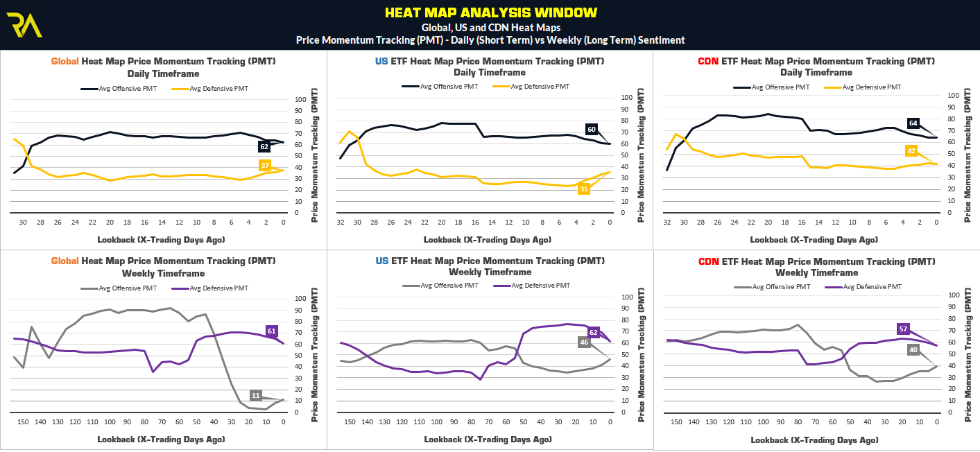
We can see that while Defensive Assets are stronger than Offensive Assets on the Weekly (longer term) timeframe across the Heat Maps. This implies, that on this time frame, following the drawdown on -32.22% in the S&P 500 in February 2020, the market has not yet recovered and transferred strength to higher risk, Offensive Assets.
However, market’s existing on different time frames. Rebuilding of longer term investment positions can start on shorter term time frames. Accordingly, our Daily PMT Heat Map Indicator shows something different.
You’ll notice on the Daily time frames, the cross of Offensive Assets over Defensive Assets, on all Heat Maps, 31 trading days prior to the close on May 6, 2020. This change in sentiment gave way to shorter term improving market conditions on March 25, 2020. From March 25 to May 6, 2020 offensive assets have had the upper hand in the Markets. In the S&P 500, from March 25 to May 6, 2020 a total gain of just north of 16% would have been realized using this Riverside indicator alone. This valuable information was also used to protect Offensive positions prior to the decline in markets in February 2020.
We use and convey this valuable information to our members each week as market conditions change.
Heat Map Radar
As we’ve shown so far, the Heat Map is a powerful tool. We can use the Heat Map to detect both Momentum and Value or Strength and Weakness. We can use the Heat Map to rank assets across multiple spectrum’s. We can use the Heat Map to assess Market Sentiment.
We can also use the Heat Map to detect movement on individual assets using or Heat Map Radar. Our Heat Map Radar is essentially comprised of two parts. The first part uses the Heat Map metrics to detect movements in individual assets based on changes in the Trend Filter (TF), Price Momentum Tracking (PMT), Technical Rank (TR) and MMR Rankings. Based on user defined thresholds, we can quickly detect changing asset behavior. This gives way to increasing or reducing asset exposure depending on market conditions.
However, what about that specific entry or exit signal?
For those specifics, we lean to our trusted Swing Detection Tracking (SDT) and Inverse Fisher RSI signals. The Heat Map incorporates this indicators to provide both entry and exit signals based on pre defined thresholds. The image below illustrates the Heat Map Radar at the right side of the Heat Map. The green up arrows illustrate entry signals, while the red down arrows illustrate exit signals generated on out Global Heat Map as of the close on May 7, 2020.
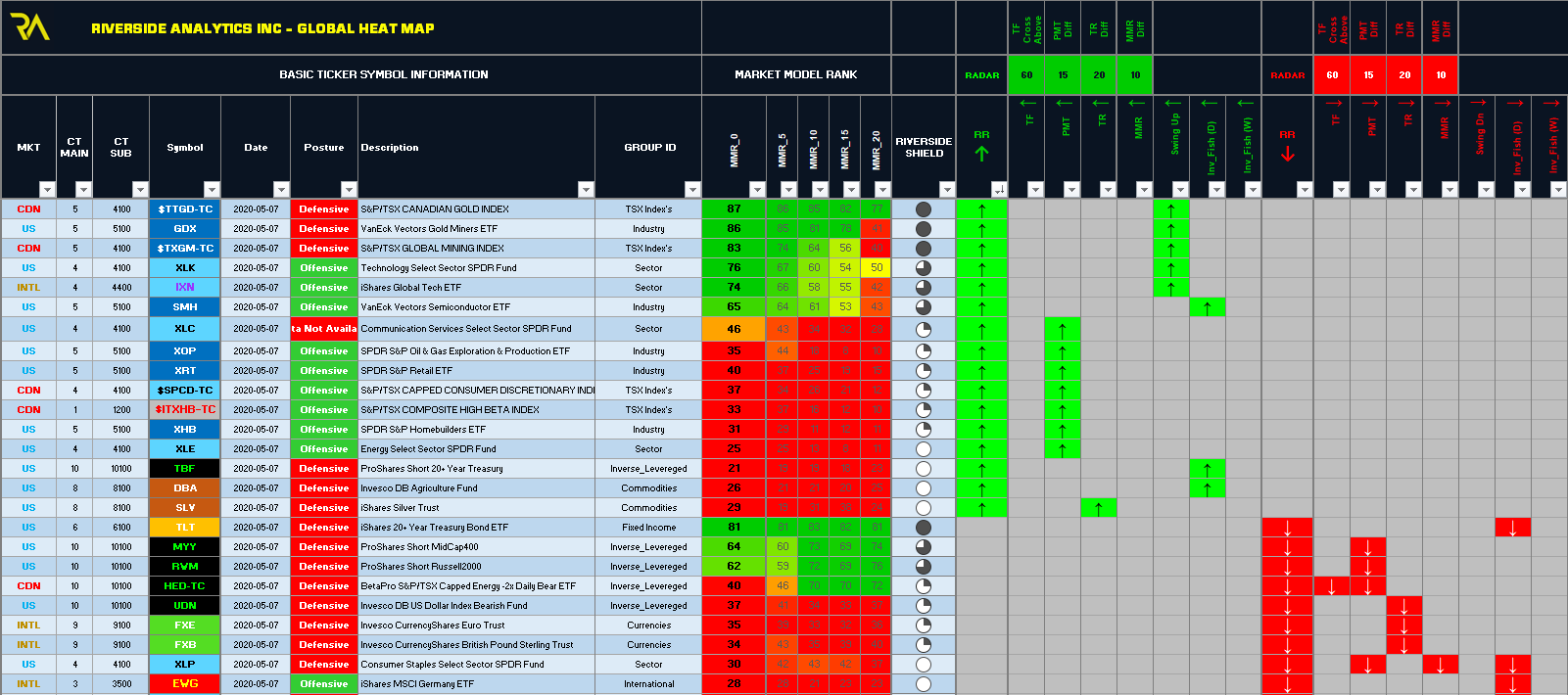
Using this signals alone, we can see that price action is advancing in Gold Miners, US Technology, US Communication Services, TSX Consumer Discretionary, etc. The entry signal on TBF provides an insight to holders of TLT that sentiment may be changing in Long Term Treasuries
We can also see exit signals on a number of inverse positions including Mid Caps, Russell 2000, TSX Energy. Further exist signals are noted in the Euro, British Pound, and US Consumer Staples to name a few.